颜色
¥Color
了解颜色系统及其在主题中的应用。
Radix Themes 自带多种色阶,每种都有各自的亮色、暗色和 alpha 渐变。底层颜色系统由 Radix 颜色 提供支持。
¥Radix Themes comes with a number of color scales, each with their own light, dark and alpha variants. Under the hood, the color system is powered by Radix Colors.
重音
¥Accents
强调色是主题中最主要的颜色。它用于主要按钮、链接和其他交互元素。accentColor 直接在 主题 组件上指定:
¥Accent color is the most dominant color in your theme. It is used for primary buttons, links and other interactive elements. accentColor is specified directly on the Theme component:
可用的强调色
¥Available accent colors
有多种强调色可供选择:
¥There is a range of accent colors to choose from:
重音比例剖析
¥Accent scale anatomy
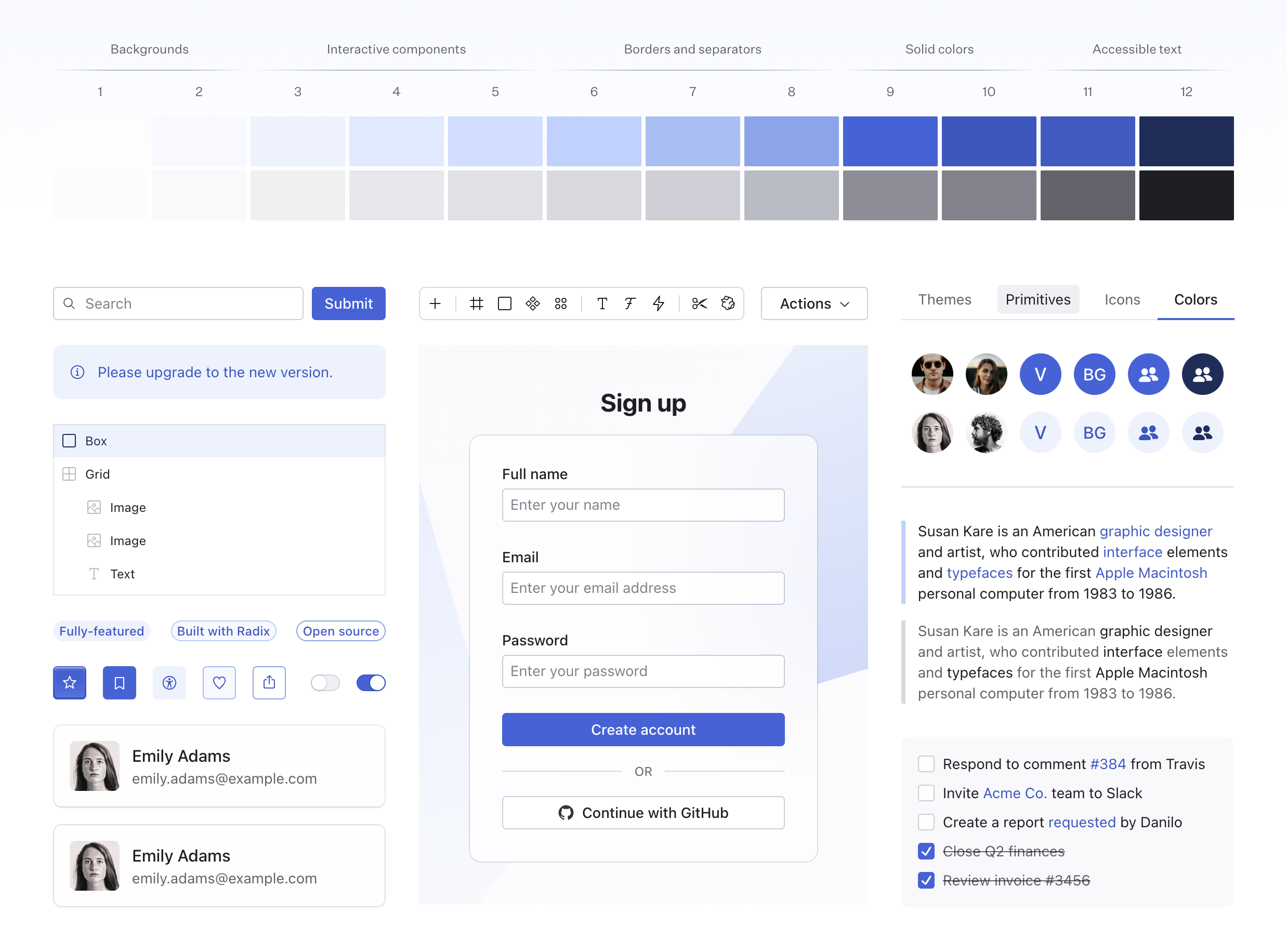
每个强调色都是一个 12 级的色阶,包含每种颜色的纯色和透明变体。例如,indigo 的颜色比例如下:
¥Each accent is a 12-step scale that includes a solid and a transparent variant of each color. For example, here’s the indigo color scale:
重音比例标记
¥Accent scale tokens
可以使用 CSS 变量访问强调色标记。你可以使用这些令牌来设置自定义组件的样式,确保它们易于访问并与主题的其余部分保持一致。
¥Accent color tokens can be accessed using CSS variables. You can use these tokens to style your custom components, ensuring they are accessible and consistent with the rest of your theme.
灰色
¥Grays
你还可以选择纯灰色或多种浅灰色。你的强调色将自动与与之互补的灰色搭配。然而,你也可以直接在 主题 组件上指定自定义的 grayColor:
¥You can also choose between a pure gray or a number of tinted grays. Your accent color will be automatically paired with a gray shade that compliments it. However, you can also specify a custom grayColor directly on the Theme component:
可用的灰色
¥Available gray colors
有 6 种灰色可供选择。差异可能看起来很细微,但在包含大量文本或密集 UI 的页面上,它的影响尤其显著。
¥There is 6 grays to choose from. The difference may seem subtle, but it is impactful especially on pages with a lot of text or in dense UIs.
灰度结构
¥Gray scale anatomy
灰色基于相同的 12 阶色阶,包含每种颜色的纯色和透明变体。例如,slate 的颜色比例如下:
¥Grays are based on the same 12-step color scale that includes a solid and a transparent variant of each color. For example, here’s the slate color scale:
灰度标记
¥Gray scale tokens
灰色颜色标记可以通过 CSS 变量访问。你可以使用这些令牌来设置自定义组件的样式,确保它们易于访问并与主题的其余部分保持一致。
¥Gray color tokens can be accessed using CSS variables. You can use these tokens to style your custom components, ensuring they are accessible and consistent with the rest of your theme.
颜色覆盖
¥Color overrides
如果可用,组件上的 color 属性可用于覆盖主题强调。嵌套的组件将自动继承新的强调色。
¥When available, the color prop on the components can be used to override the theme accent.
Nested components will automatically inherit the new accent color.
单独的颜色标记
¥Individual color tokens
可以使用类似的 CSS 变量通过其对应的名称直接访问各个颜色。例如,红色可以通过 --red-1、--red-2 等访问,直至 --red-12。
¥Individual colors can be accessed directly using similar CSS variables by their corresponding names. For example, the reds are accessed via --red-1, --red-2, and so on up to --red-12.
高对比度
¥High contrast
大多数情况下,带有 color 属性的组件也提供 highContrast 选项,以实现在页面背景下脱颖而出的外观:
¥Most of the time, components with a color prop also provide a highContrast option that achieves appearance that stands out against the page background:
焦点与选择
¥Focus and selection
Radix Themes 会根据当前组件的强调色自动调整焦点和选择颜色。大多数情况下,设置 color 属性会智能地更改焦点和选择颜色,以避免色调冲突:
¥Radix Themes automatically adjusts the focus and selection colors depending on the accent color of the current component. Most of the time, setting the color prop will intelligently change the focus and selection colors to avoid a mismatch of conflicting hues:
焦点缩放标记
¥Focus scale tokens
可以使用 CSS 变量访问焦点颜色标记,这些变量遵循与其他比例尺类似的命名结构,例如 --focus-1、--focus-2,依此类推,直到 --focus-12。
¥Focus color tokens can be accessed using CSS variables that follow a similar naming structure like the other scales, e.g. --focus-1, --focus-2, and so on up to --focus-12.
大多数组件使用 --focus-8 作为焦点轮廓颜色。
¥Most of the components use --focus-8 for the focus outline color.
Alpha 颜色
¥Alpha colors
每种颜色都有一个 alpha 变量,旨在使其与页面背景重叠时看起来一致。这是一个强大的工具,可以让颜色在其他背景上叠加时看起来更自然。所有数值颜色步骤都有相应的 alpha 变体。
¥Every color has an alpha variant which is designed to appear visually the same when placed over the page background. This is a powerful tool that allows colors to look naturally when overlayed over another background. All numerical color steps have a corresponding alpha variant.
Radix Themes 组件内自动使用 Alpha 颜色 - 无需额外配置。
¥Alpha colors are used automatically within Radix Themes components—no additional configuration is required.
背景
¥Backgrounds
Radix Themes UI 中使用多种背景颜色来营造视觉层次感。这些颜色用于背景、卡片和其他界面。
¥A number of background colors are used to create a sense of visual hierarchy in Radix Themes UIs. These colors are used for backgrounds, cards, and other surfaces.
面板背景
¥Panel background
panelBackground 属性控制面板元素是使用纯色还是半透明背景色。默认的 translucent 值会产生微妙的叠加效果:
¥The panelBackground prop controls whether panelled elements use a solid or a translucent background color. The default translucent value creates a subtle overlay effect:
Sign up
当你希望清晰地呈现信息时,solid 非常有用。
¥While solid is useful when you'd prefer to present information unobstructed.
Sign up
自定义
¥Customization
Radix Themes 的颜色可以通过覆盖 token 系统相应的 CSS 变量进行自定义。有关颜色标记的完整列表,请参阅 源代码。
¥Radix Themes colors can be customized by overriding the corresponding CSS variables of the token system. Refer to the source code for the full list of the color tokens.
确保你的 CSS 在 Radix Themes 样式之后应用,以便其优先。
¥Make sure that your CSS is applied after the Radix Themes styles so that it takes precedence.
品牌颜色
¥Brand color
你可以通过重新映射相应的令牌,将特定颜色替换为你的品牌颜色。通常,你会覆盖用作主题强调色阶的第 9 步。
¥You can replace a specific color with your brand color by remapping the corresponding token. Usually, you’d override step 9 of the scale that you are using as your theme accent.
在此示例中,使用纯色 indigo 组件现在将引用你的自定义颜色。
¥In this example, using solid-colored indigo components will now reference your custom color.
自定义调色板
¥Custom palette
你可以使用 自定义调色板工具 仅基于一些参考颜色生成自定义调色板。对结果满意后,请将生成的 CSS 粘贴到你的项目中。你可以重命名生成的颜色,以匹配你想要在主题中使用的重音。
¥You can use the custom color palette tool to generate a custom palette based just on a couple reference colors. Once you are happy with the result, paste the generated CSS into your project. You can rename the generated colors to match the accent that you want to use in your theme.
要生成暗黑主题颜色,请切换外观以使用暗黑主题。确保在浅色主题颜色覆盖后粘贴生成的 CSS。
¥To generate dark theme colors, toggle the appearance to use the dark theme. Make sure to paste the generated CSS after your light theme color overrides.
颜色混叠
¥Color aliasing
你可能更喜欢使用通用颜色名称来引用你想要使用的颜色色调。例如,通常将 crimson、jade 和 indigo 分别称为 red、green 和 blue。
¥You may prefer to use generic color names to refer to the color shades that you want to use. For example, it is common to refer to crimson, jade, and indigo as red, green, and blue respectively.
在这种情况下,你可以重新映射 Radix 主题标记,并重新使用你想要使用的颜色名称:
¥In this case, you can remap Radix Themes tokens in place of one another and reclaim the color names you want to use:
在此示例中,在 Radix Themes 组件和标记中使用 red 颜色现在将引用原始的 ruby 比例。
¥In this example, using the red color in Radix Themes components and tokens would now reference the original ruby scale.
单独的 CSS 文件
¥Individual CSS files
颜色定义约占 Radix Themes 附带的 CSS 总大小的 20%。
¥Color definitions comprise around 20% of the total CSS size that Radix Themes ships with.
如果你希望减小 CSS 包的大小,并且只访问你使用的颜色,你可以为每个颜色模块导入单独的 CSS 文件。这是一个示例设置:
¥If you’d prefer to reduce your CSS bundle size and have access just to the colors you use, you can import the individual CSS files for each color module. Here’s a sample setup:
请注意,React 中的 color prop 仍然会接受你未导入的颜色。此外,请确保你的开发者工具 preserves 已按导入的 CSS 文件的顺序排列。
¥Please note that the colors you didn’t import will still be accepted by the color prop in React. Also, make sure that your developer tooling preserves the order of the imported CSS files.